
Understand Print Image Resolution for Quality Prints
Table of Contents
- "My Images look good but print bad"
- Image Resolution / Image Density
- Large, High-Resolution Images
- Low vs. High Resolution
- Why Images Look Good on Screens
- How Color Printing Works
- Keep Image Quality Intact
- Effect of Viewing Distance
- Enlarging a Small Image
- Before You Hit Print
- Published Research
- What's Next?
Author: Gustavo Baner
First Published:
Updated:
More articles @Printing Academy
🎧 Prefer to Listen?
A friendly audio version of this guide — covers everything on the page in about 14 minutes.
"My Images Look Great on My Screen But Print Badly"
This is one of the most common questions we hear. The short answer: screens display images at 72 PPI, but printing requires 300 DPI — about 4× more detail. When that detail isn't there, your print comes out pixelated or blurry.
We'll walk you through why this happens and how to avoid it. Here's what we cover — jump to what you need:
- What resolution and DPI actually mean
- Where to get high-resolution images
- Why images look good on screens but not on paper
- Which file formats keep your quality intact
- What happens when you enlarge a small image
- The resolution your file actually needs for print
This guide covers paper and digital press printing. Large format (banners, signs) involves different variables — we'll cover that separately.
Did you know? Researchers study how our eyes perceive pixelation — they call it "quantization." We've linked published research on the topic at the bottom of this page.
Interesting Fact: Psichologysts and resarchers study how human perception is affected by but what they call "quantization" of an image, which is the pixelation. We have linked some valuable resources if you want to deep even deeper. Here is a link: Published books and resources about the topic
4 Steps to a Good Print Outcome

1. High Resolution — Use images at 300 DPI or higher at your print size
2. Correct File Format — Save as PDF, TIFF, or high-quality JPEG — never GIF
3. Don't Scale Up — Enlarging a small image adds pixels but not detail
4. Ask Your Print Shop — We check your file before printing — call us
What is Image Resolution? What is Image Density?
Image Resolution refers to the level of detail an image holds. It’s determined by the number of pixels or dots contained within an image. The more dots in an image, the more detail is in the image itself.
We usually talk about “pixels” when we refer to images and screens. We refer to “dots” when we refer to images printed on paper.
There are two physical dimensions to be considered for an image: width and height of an image.
Image Density - DPI / PPI : The density is measured in “dots per inch – DPI” or “pixels per inch – PPI”
The density tells us about how concentrated the dots are in a specific area. The more concentrated the dots, the closer and tightly packed, the better an image looks.
Tip #1 – The more dots that an image has in a certain dimension, the better the image look

Image resolution
Where Do Large, High-Resolution Images Come From?
You don't need expensive equipment. Here are four reliable sources for print-quality images.
📷 Digital Cameras & Smartphones
Modern smartphones work if set to the highest quality. Professional cameras are even better. Always transfer the original file — via email, USB, or cloud storage.
🖨️ Scanners
Scan printed photos or artwork at 300 DPI minimum (600 DPI if it includes text). The print will look great as long as it's the same size or smaller than the original.
🎨 Design Software
Photoshop, Illustrator, Canva, CorelDRAW — they all work. The key: set your document to 300 DPI before you start. A file created at 72 PPI for web won't have enough detail.
📸 Stock Photo Sites
Always download the largest size available and check the pixel dimensions against your print size needs. Free options: Unsplash, Pixabay, Freepik
⚠️ Never send photos via text message or WhatsApp if you plan to print them. These apps compress your images and the lost detail can't be recovered. Always keep your original full-size file safe.
See the Difference: Low vs. High Resolution
We downloaded the same photo twice from a stock site — once at low resolution (73 KB) and once at high resolution (270 KB). They looked identical as thumbnails. Here's what happened when we zoomed in:

❌ Low resolution — 73 KB · 1.3 megapixels

✅ High resolution — 270 KB · 4.5 megapixels
Why the difference? The high-res image contains 4× more pixels — 4.5 million vs. 1.3 million. More pixels means more detail. Notice how the hand and phone on the left look blurry, while the right side is sharp and clean. The file size (73 KB vs. 270 KB) is actually a quick clue: a very small file usually means low resolution.
Each pixel is a tiny square of color. The word "pixel" comes from "picture element." The more of these tiny squares packed into an image, the more detail your eye can see — and the better it will print.
Why Images Look Good on Screens
Screens make almost everything look sharp because of how they work:
- Self-lit pixels: Every dot on your screen is a tiny light that can display any of 16 million colors
- Low density is enough: A standard PC monitor uses 72 PPI. Modern Retina and 4K screens pack 163–218 PPI — still far less than print's 300 DPI
- Smart software: Your device's graphics processor works to make the image look as good as possible, smoothing edges and blending colors on the fly
- Viewing distance helps: You look at a phone from about 1 foot away, a desktop from 1.5–2 feet. At those distances, even low-res images can look fine
A single screen pixel up close
The bottom line: Your screen is doing your image a favor. It fills in gaps, smooths rough edges, and lights everything from behind. Paper can't do any of that — which is why the same image can look great on screen and terrible in print.
How Color Printing Actually Works
Here's something most people never think about: what looks like "full color" on a printed flyer, business card, or brochure is actually made from just 4 ink colors and the white of the paper. Nothing else.
The inks are Cyan (a light blue), Magenta (a pinkish red), Yellow, and Black — known universally as CMYK. This is called process color printing (or full color printing), and it's been the standard since 1906.
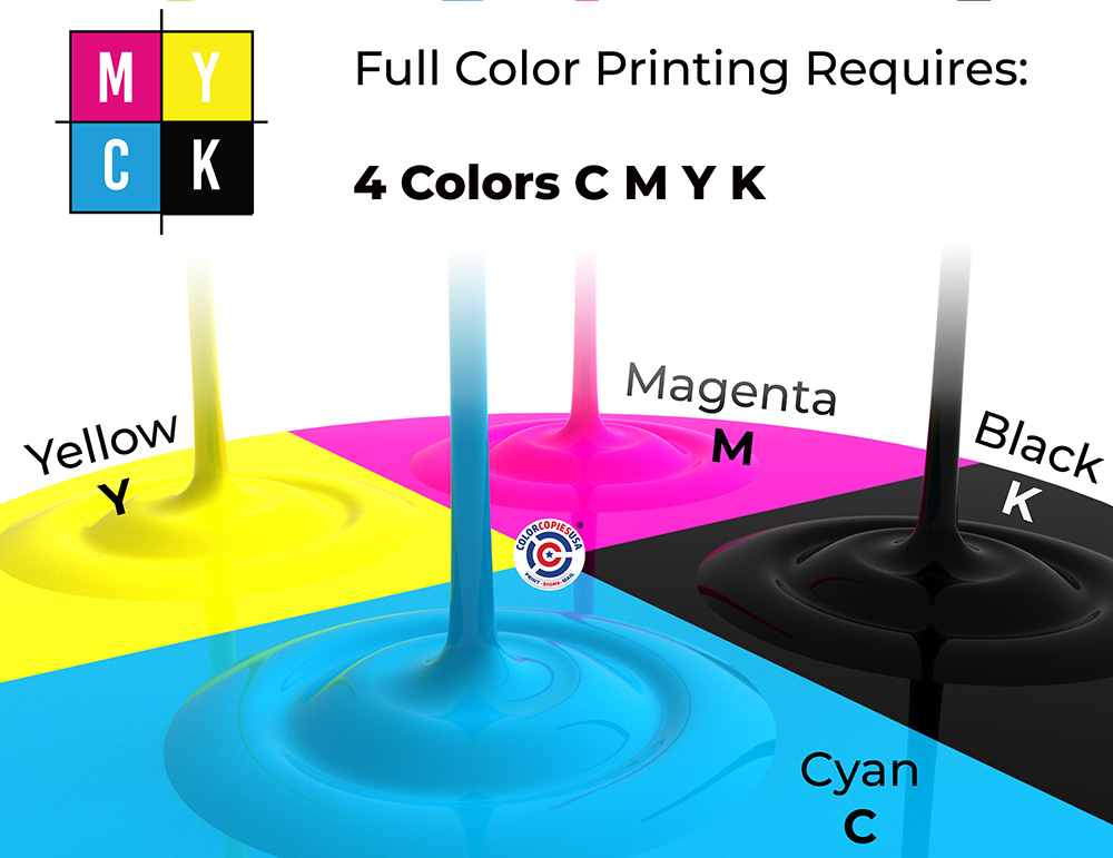
The four ink colors: Cyan, Magenta, Yellow, Black
The press prints each color as a layer of tiny dots. Each dot is just one ink at one size — it can't blend or glow like a screen pixel. The dots vary from barely visible to solid, creating what printers call halftones — the smooth gradients and shading that give a printed image its depth.
Because it takes dots from all four inks to produce a specific color, they overlap on the paper. Your eyes do the final mixing — blending Cyan, Magenta, Yellow, and Black into greens, oranges, purples, and every shade in between. The white areas? That's just the paper showing through, reflecting light.

Up close: individual CMYK dots. At reading distance, your eyes blend them into full color.
So Why Does Print Need So Much More Image Data?
Here's what surprised us when we first learned this:
A single pixel on your screen can display any of 16 million colors — and it makes its own light. So screens only need about 72 pixels per inch. That's roughly 5,200 pixels in one square inch, and each one is a master painter with a full palette.
A single printed dot? It can only be one of 4 inks, at one size — that's roughly 200 possible shades per dot. So the printer compensates with quantity: 300 dots per inch, which packs 90,000 dots into one square inch.
Print uses 17× more dots to make up for each dot carrying 80,000× less color information. And it still can't fully match a screen's vibrancy. That's why your files need to be so much bigger for print.
In fact, the full-color image you see on a printed page doesn't really exist on the paper — it exists in your eyes, assembled from thousands of tiny single-color dots.

One pixel is a master painter. A printed dot carries just one ink — so the press sends an army of 90,000 per square inch.
Screen vs. Print: Side by Side
| Screen | ||
|---|---|---|
| Density | 72 pixels per inch | 300 dots per inch |
| Per square inch | ~5,200 pixels | ~90,000 dots |
| Colors per dot | 16 million (each pixel) | ~200 shades (1 of 4 inks at one size — your eyes do the mixing) |
| Light source | Each pixel emits its own light | Paper reflects light through ink |
| Color vibrancy | Higher contrast, brighter | Softer — color is subtracted from white paper |
The practical rule: An image that fills 1 inch on your screen (at 72 PPI) would print at only about ¼ inch. Your print files need to be roughly 4× larger than what looks good on screen. This is the single biggest reason images look great on a monitor and come out pixelated on paper.
Keeping Your Image Quality Intact
A great image can lose quality before it ever reaches the printer — through the wrong file format, the wrong app settings, or even how you send the file. Here's how to protect your image at every step.
File Formats — Best to Worst for Print
🥇 Best: TIFF or PNG
Lossless compression — no detail is thrown away. Files can be large, but the quality is perfect for print.
🥈 Good: High-Quality JPEG
When exporting to JPEG, always choose the highest quality setting (90–100%). Some detail is lost, but it's usually fine for most print jobs.
🚫 Avoid: GIF or Low-Quality JPEG
GIF is for simple web graphics only. Low-quality JPEG throws away too much data — it may look fine on screen but will print blurry.
Before You Touch Any Software
📷 Shoot at maximum quality. Set your phone or camera to its highest resolution — always. Even if the project is small, start with the biggest file you can get.
📁 You can shrink, but you can't enlarge. A large image can always be reduced for a smaller print. But a small image made bigger will pixelate — the missing detail simply isn't there.
📲 Never share via text or WhatsApp. Messaging apps compress images silently. Use email, USB, or cloud storage (Google Drive, Dropbox) to transfer originals.
Software That Can Quietly Ruin Your Images
These programs are great tools, but each one has a setting that can reduce your image quality without warning:
Adobe Photoshop
When you shrink an image in Photoshop, it throws away pixels permanently. If you then enlarge it back, those pixels don't come back — the image stays soft. Always keep an untouched copy of the original before resizing. Experienced users can use "Smart Objects" to work non-destructively.
Microsoft Word & PowerPoint
Word automatically compresses every image you paste in to keep the file size small. Your image may look fine on screen but will print blurry. Fix: Go to File → Options → Advanced → scroll to "Image Size and Quality" → check "Do not compress images in file."
Canva
When you download a Canva design, the default export may be set to web quality (72 PPI). Fix: Choose "PDF Print" or "PNG" and make sure "300 DPI" is selected under download options before exporting.
Other Design Apps
In programs like Illustrator, CorelDRAW, or Publisher, the output intent must be set to "Print" before you start designing — not after. If you begin with a web-intent document, images may be reduced automatically in ways you can't undo.
🏷️ One more tip: Name your files clearly — something like menu-cover-HIGH.jpg vs. menu-cover-web.jpg. When you're in a rush before a deadline, you'll be glad you did.
Why Viewing Distance Matters
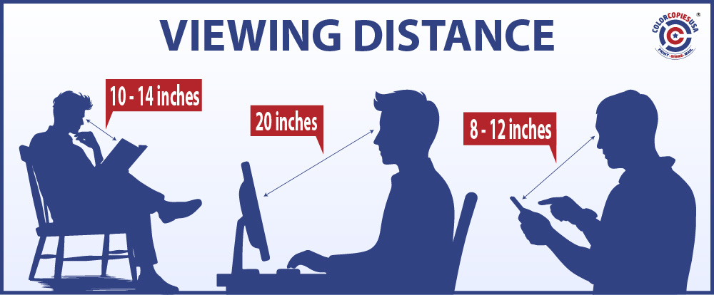
Average viewing distances for screens, print, and signage.
The same image can look sharp, out of focus, pixelated, or even unrecognizable — depending on how close you are when you look at it. This is called viewing distance, and it's the reason a flyer needs much higher resolution than a banner on a wall.
Our eyes can only distinguish detail up to a certain point. Scientists call this visual acuity. When printed dots are small enough and close enough together, our eyes blend them into smooth, continuous color. But when we hold a flyer, newsletter, or magazine just 10–14 inches from our face, those dots need to be very small — or we start to see the pixelation.
How Close Will Someone Look? That Decides Your Resolution.
| What You're Printing | Typical Viewing Distance | Resolution Needed |
|---|---|---|
| Business cards, flyers, brochures, booklets | 10–14 inches (handheld) | 300 DPI |
| Posters, menus, signs | 2–6 feet | 150–200 DPI |
| Banners, trade show displays | 10+ feet | 72–100 DPI |
| Screens (phone, monitor) | 1–2 feet | 72–96 PPI |
The closer someone holds your print, the more dots per inch you need. That's why an image enlarged from a small file looks fine on a screen at arm's length — but pixelated on a flyer held in someone's hands. More on that in the next section: Consequences of Scaling Images Up.
What Happens When You Enlarge a Small Image

Stretching a printed image works the same way — the bigger you pull, the more the detail breaks apart.
You've probably done this with a photo on your phone: pinch to zoom in, and at some point you start seeing squares instead of a smooth image. That's exactly what happens when you try to print a small image at a large size — the computer has to invent pixels that don't exist in the original file.
Those invented pixels are the computer's best guess at what might go in the gaps. On a screen, the guesses can look passable because each pixel has 16 million colors to choose from. In print, with only 4 inks and physical dots, those guesses show up as blurry blocks and rough edges — what we call pixelation or artifacts.
See It for Yourself
We downloaded a small image from the web — just 200 × 200 pixels, a 3.7 KB file. It looked fine as a thumbnail. Then we enlarged it:
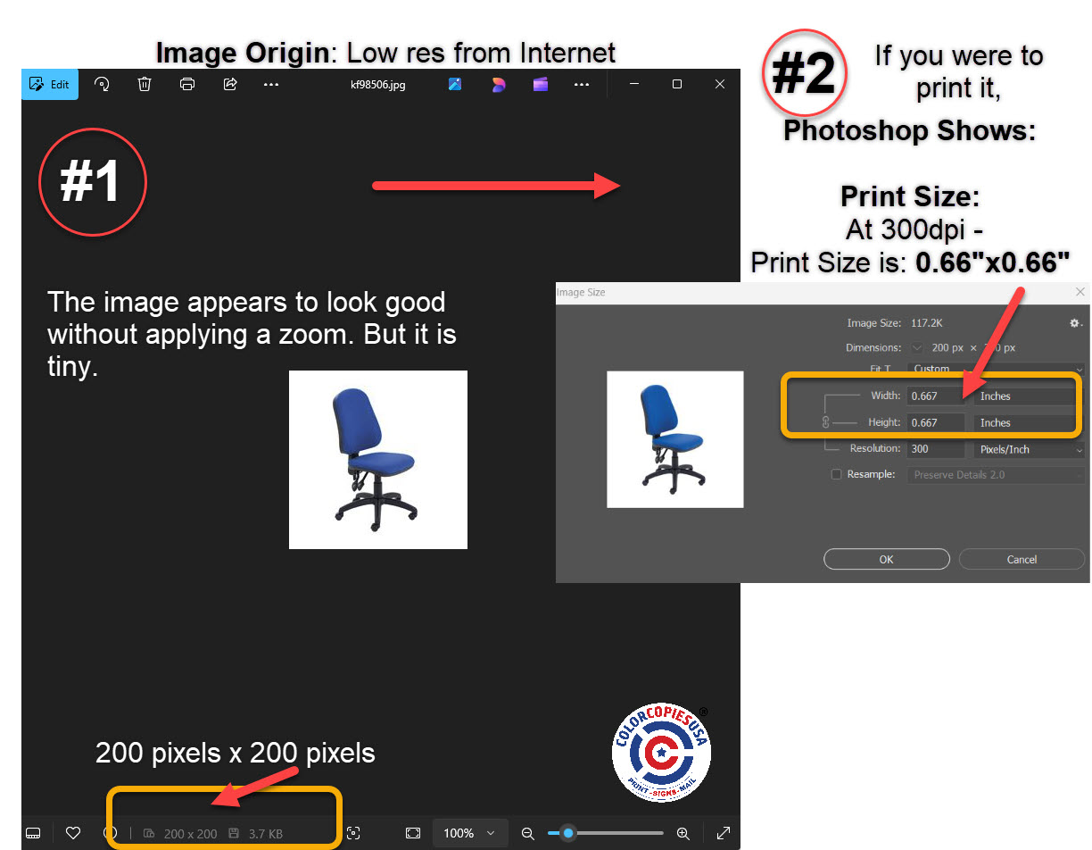
✅ Original size: 200×200 px — looks fine

❌ Enlarged — pixelation everywhere
How Much Can You Enlarge Before It Shows?
| Enlargement | What to Expect | Safe for Print? |
|---|---|---|
| Up to 25% | Usually no visible difference | ✅ Yes |
| 25%–50% | Slight softness may appear | ⚠️ Acceptable for flyers, not for close-up pieces |
| 50%–100% (doubled) | Visible pixelation, blurry edges | ❌ Noticeable on business cards, brochures, booklets |
| 200%+ (tripled or more) | Severe blocky artifacts | ❌ Unusable — find a larger original |
The rule is simple: always start with the largest, highest-resolution version of your image. You can always make a big image smaller without losing quality — but you can never make a small image bigger without losing detail. If your original is too small, the best fix is to go back to the source: re-shoot the photo, re-download at a larger size, or ask your designer for the full-resolution file.
Before You Hit Print
You understand the why now. Here's your go-to reference for every future print project.
Published Research Resources
-
"Pixelated Image Abstraction" by Timothy Gerstner et al. (2012):
This study presents an automatic method to abstract
high-resolution images into low-resolution outputs with reduced
color palettes, emulating the style of pixel art. The authors
discuss the challenges of maintaining image clarity and detail
when reducing resolution, which is pertinent to understanding
pixelation in printed images. -
Link to the source. -
Perception of Pixelated Images" edited by Talis Bachmann (2016):
This book compiles research on how pixelation affects image
perception. It explores the balance between image resolution and
the viewer's ability to recognize content, providing insights into
how pixelation impacts visual interpretation.
- Link to the author:
- Link the book review: -
"Avoiding Twisted Pixels: Ethical Guidelines for the Appropriate
Use of Digital Image Processing in Scientific Publications" by
Michael W. Rossner and Kenneth M. Yamada (2004): This article
discusses the ethical considerations and technical implications of
digital image manipulation, including pixelation. It provides
guidelines on maintaining image integrity, which is crucial when
preparing images for publication and can inform best practices to
avoid unintended pixelation during printing.
Link to the author:
Now That You Understand Resolution — What's Next?
You know why your images looked bad. Now make sure the rest of your file is print-ready too. These guides walk you through the complete process:
Step-by-step export from Word, Canva, Google Docs, InDesign & Apple Pages. Covers bleed, fonts, color mode, and a pre-flight checklist.
The 300 DPI rule for paper printing and 150 DPI for large format — with a reference chart by product type.
Why printers need bleed, the standard 1/8-inch requirement, and how to set it up in your design software.
Ready to Print?
Upload your file and get instant pricing with free shipping on most orders.
Color CopiesBookletsPostcardsBannersPosters
Questions about your file? Call us at 1-877-421-0668 — we review every file before printing.